Posted March 15, 2006
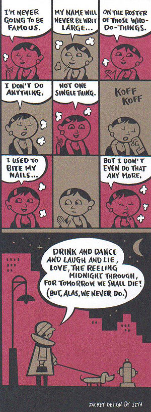
The 2006 edition of The Portable Dorothy Parker boasts a jacket design that Mrs. Parker — an avowed fan of comic strips and cartoons — would be thrilled to see. Penguin Classics called on the talents of Seth, a cartoonist best known for his graphic novels Clyde Fans (Drawn and Quarterly, 2004) and Wimbledon Green (Drawn and Quarterly, 2005). The Ontario native has also drawn covers for The New Yorker. He is currently working on a 12-year project to design the box sets of every Peanuts strip by Charles Schulz. Seth took time for a chat with Kevin Fitzpatrick.
How did you come to the Portable Dorothy Parker?
As usual with these kinds of stories, it’s not that exciting. This other cartoonist, Chris Ware, they got to do the cover for Candide. He did it in a comic strip format. I think they were just so excited by what he had done with it that they decided to approach some other cartoonists to see if they could extend it into a small line approach to the (Penguin) Classics stuff. The art director, Paul Buckley, was somewhat familiar with the world of comics and he tried to pick people who would be appropriate for different books. I have a long-standing interest in the old New Yorker. I think that’s why he picked me to work with Dorothy.
Were you familiar with Dorothy Parker before you landed the project?
I had read most of her short stories. I read at least “Enough Rope” for most of the classic poetry. Back in the late ’80s I got really interested in the cartoonists of the old New Yorker. Basically the Twenties to the Fifties. That sort of led me into reading the history of The New Yorker and led me to reading the writers most associated with it. So certainly I’d read a good portion of Dorothy Parker’s work in the late Eighties and early Nineties. But of course like anything I had to re-read a great deal of it when it came time to work on the book.

I wouldn’t say random, but I’d say it was intuitive. I quickly sat down and re-read What Fresh Hell is This. I knew I wanted to have some sort of a biographical strip but I knew I needed to get the details into my head. While reading that it kind of sparked what stories I was most interested in and then I re-read those stories. I picked the stories that I remember liking the most. The material sort of fell into line as I was reading through this or that, an idea would spark. I read the quote by Woollcott and I just felt like it was a good line. It all came together pretty intuitively.
What is your favorite Parker short story?
It’s definitely “Big Blonde” and it pretty much always has been. I really think that’s her masterpiece.
And for poems? A favorite?
That’s pretty tough. I don’t know if I have a particular favorite. I know which ones make me laugh. But then that’s not really the greatest criteria. I don’t think I have a favorite, to tell you the truth. I think I like them as a collective entity.

I submitted sketches and then surprisingly they didn’t make much in the way of fiddling. The one thing they said to me at the beginning was, “Don’t make it too depressing.” That sort of put me off right away because I thought I’d like it to be a bit depressing; I actually would’ve liked to have been much more depressing. It seemed hard to me to write about Dorothy Parker without having some element of pathos to it. So I immediately thought that didn’t sound good.
But then I just said I’d do what I do. I kept (that) in mind, kept it light-hearted. And when I submitted the roughs, almost the first comment from the editor was, “I thought I asked you not to make it too depressing.” And I said, “Actually, I tried very hard not to make it too depressing. I think its pretty light.” Then he showed it to everybody else, and it seems like nobody else seemed to think it was depressing. So it was fine. I think if nobody had said that to me in the very beginning, I think I might have tried to do something a touch more serious with part of it. I would have liked to have done a strip that touched on the real unhappiness in her life, rather than play it for laughs. Which I think could’ve worked, but I steered away from that, and I don’t think they would’ve gone for that, actually.

I think it was purely a holdover from the Chris Ware book. I’m not sure if he asked for the flaps, or if they decided to initiate that style for the paperbacks. I think I was just working exactly with the format that Chris Ware had before me. I guess they extended that to everyone else that is working in the series.
I was looking at your list of work. You have a background in, I won’t say packaging, but more along the lines of being a creative director for books. I’m thinking of the Peanuts project.
Yes, I’ve been doing a lot more of that in the last few years, definitely.
Is that fun? Is that a different kind of challenge? Why do you like doing these projects?
It’s fun when you care about the project, definitely. In fact, I’ve been a commercial illustrator for years, besides being a cartoonist, and that’s not fun. That’s like the kind of thing, I find, you’re just selling style in a way. They take some article that’s kind of boring and then they get you to dress it up with something, just to make people look at it. That seems dull. But working on a project like this, or something like Peanuts, which is very dear to my heart, you invest a lot more into it. It starts to feel like your own work in a weird way. It’s the difference between feeling like you’re just trying to sell something or that you’re trying to create something with dignity around it. I guess it’s like trying to make a nice set of clothing that’s actually well-made, and makes a person look nice. It’s how I sort of look at it. It’s not my work. I didn’t write the stories, or I didn’t do those comic strips. But I want them to have as much dignity as they can, while still having some charm. So it’s packaging but with some actual love for the material. I view it differently than when I do something purely with the intent of trying to come up with something grabby.
But for a box set of Peanuts, that’s more work than doing a cover for The New Yorker. Is that like switching gears?
No, it’s all kind of the same continuum to some degree. I actually prefer doing something like the Peanuts book because I have a bigger palette to work with in a way. A lot of times with packaging a book, I think of how all the various elements work together. That gives you – much like doing a cartoon story – a wider range of devices to create the whole feeling you are going for. Even with the Dorothy Parker book, it probably would have been more satisfying to go into the book and do some design on the inside. Working on the covers alone gives you four of five elements to work with. But it’s always nice if you can go a little further, and have maybe a double-page spread that you can move across, or what you would do with the title page. These elements all work together to allow you to create a mood with whatever it is. I think that’s what I’m usually thinking with this material, trying to create a mood appropriate to the work.
What I like about it, when you look at the book on a shelf, it looks so different from all the other books, because of the design of the spine. I already tried it out on the bookshelf, and the Portable really stands out with the illustration, the quote, and the name down the spine.
It’s great to work with all these different areas. It’s like you get to compose a little poem by putting it all together. It would have been nice to have gone a touch further – I thought of this later – a bit more narrative. I kind of (accomplished this) with the little biography, but that’s really jumpy because you’re jumping around from one event to another. It would have been nice to do some scene from her life, but you know, you have limited space.
I thought that too, especially after I read “Clyde Fans.” If you would have gotten the chance to do one of her monologues…
Yeah, that would have been nice. I would have liked to have squeezed in one more thing, and that would definitely have been the thing to put in there. Something where you got a bit more of a sense of her voice. I tried to get it in with the poems, but that was only because they were short. I knew I could manage to squeeze in a couple of poems. But it would have been nice to go a touch further.
Well maybe someone will read this and say, “You know what? I’m going to hire Seth to draw…”
(Laughs) Maybe! We’ll see!
“We’ll pay him a lot of money. It’s David Remnick’s money or something…”
(Laughs)
My last question… I read that you have a model village that you’re building in your basement. Do you have any speakeasies created yet?
No, I don’t think so, because it’s a fictional northern Ontario town. Prohibition was of such little interest here in Canada, that I didn’t give it much thought. I’ve got a couple of taverns, but they’re legal taverns.
Kevin Fitzpatrick is the president of the Dorothy Parker Society. He is the author of “A Journey into Dorothy Parker’s New York” (Roaring Forties Press, 2005). He leads walking tours devoted to Mrs. Parker and the Algonquin Round Table.

